LinkedIn impressions — the count of how many times your post loaded on someone's screen — are one of the most misread numbers in professional social media. A pattern observed consistently across LinkedIn accounts is that creators assume high impression counts mean wide reach, when in reality a single person scrolling past the same post three times generates three impressions. Understanding the difference between exposure and actual audience size is the foundation of any meaningful LinkedIn content strategy. This guide breaks down exactly how impressions are counted, what benchmarks actually look like in 2026, and which tactics reliably move the number in the right direction.
- LinkedIn impressions count every time your post loads — not unique viewers. One person seeing your post five times = five impressions.
- Members Reached (LinkedIn's reach metric) is the more honest measure of actual human audience size — watch this alongside impressions.
- A healthy impression-to-reach ratio sits between 1.5x and 4x; above 5x suggests you're being repeatedly shown to a small group rather than expanding to new audiences.
- The first 60–90 minutes after posting are critical — early engagement triggers algorithmic amplification that compounds total impressions.
- Most counterintuitive finding: your own views count toward your impressions total, further inflating the number above real audience size.
- For creators focused on real visibility growth, combining early engagement signals with a tool like HyperClapper can accelerate that critical first-wave distribution.
- What Are LinkedIn Impressions? A Plain-Language Definition
- LinkedIn Impressions vs Reach: Why the Numbers Are Never Equal
- How the LinkedIn Feed Visibility Algorithm Affects Impressions
- What Is a Good Number of Impressions on LinkedIn?
- How to Increase Impressions on LinkedIn: Tactics That Actually Work
- LinkedIn Analytics Metrics Explained: Reading Your Dashboard
- Risks and Limitations of Using Impressions as Your Primary Metric
- Frequently Asked Questions About LinkedIn Impressions
What Are LinkedIn Impressions? A Plain-Language Definition

What are LinkedIn impressions? A LinkedIn impression is recorded every single time your post is displayed — in a user's feed, in search results, or on your profile page. The key word is every time. It is not a count of unique people. It is a count of load events. One person who sees your post on Monday morning, again at lunch, and once more on Tuesday generates three impressions from a single viewer.
This is the mechanic behind the gap that confuses most creators: your impressions total will almost always be significantly higher than your actual audience size. That is not a bug — it is how the metric is defined.
How LinkedIn Impressions Are Counted: The Exact Mechanics
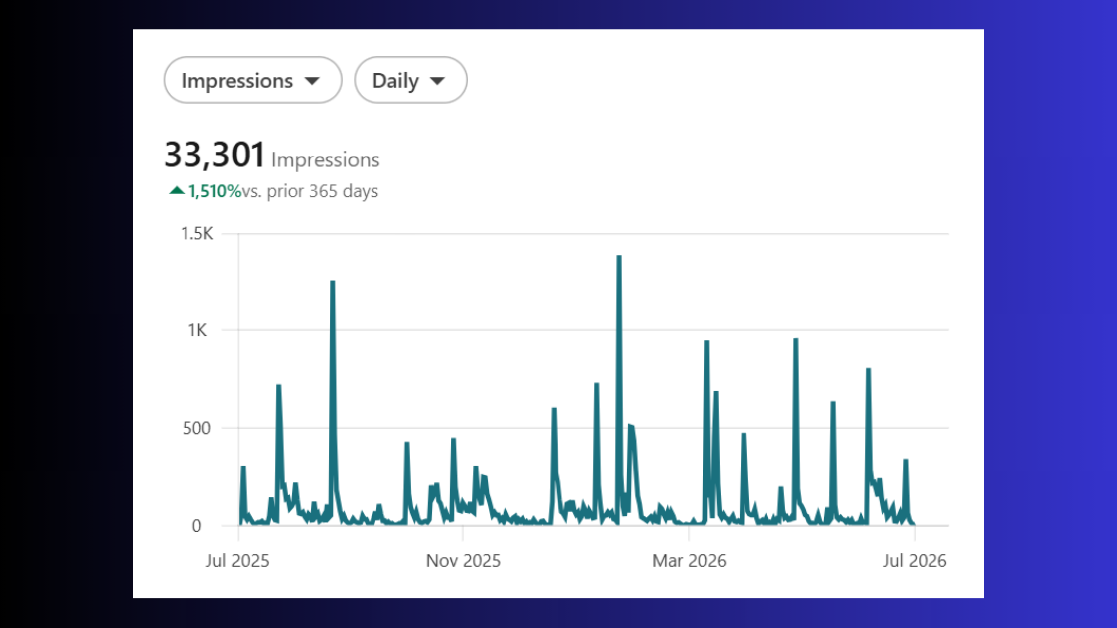
LinkedIn counts an impression when a post occupies at least a portion of a user's visible screen area — it does not require the user to click, react, or even fully scroll through the content. Three specific scenarios generate impressions worth understanding:
- Repeat views from the same person — each session creates a new impression
- Your own views — yes, LinkedIn does count impressions including your own views when you look at your own post
- Shared reposts — when someone reposts your content, it can generate impressions from their network that also roll into your count
This is why how LinkedIn impressions are counted matters strategically: a 1,000-impression post with 300 members reached means roughly 3.3 exposures per viewer on average — healthy recirculation within your existing audience, but not necessarily strong expansion to new people.
Does LinkedIn Count Impressions for Every Post Type?
Does LinkedIn count impressions for every post type? Yes — native text posts, image posts, video posts, document/carousel posts, polls, and company page posts all generate impression data. LinkedIn articles and newsletters track engagement slightly differently (their metric appears as "views" in the article analytics tab rather than "impressions" in the standard post dashboard), but the underlying counting logic is the same. Company page posts surface impression data inside the Page Analytics section rather than the personal post analytics panel, so the interface differs even though the mechanism is identical.
Understanding the raw definition sets the stage — but the metric only becomes useful when you see how it compares to reach, the number that actually tells you how many real people your content touched.
LinkedIn Impressions vs Reach: Why the Numbers Are Never Equal
LinkedIn impressions vs reach is the most commonly misunderstood pairing in LinkedIn analytics. Members Reached is LinkedIn's label for reach — it counts unique LinkedIn members who saw your post at least once. Impressions counts total display events. They measure different things, and they will never match.

The number that tells you how many people you reached is Members Reached. The number that tells you how often your content was in front of them is Impressions. Confusing the two leads to inflated assumptions about audience size that rarely hold up when you check conversion data.
A recurring pattern among creators analyzing their LinkedIn post impressions meaning for the first time is a feeling that the platform is inflating the data. It is not. A post showing 1,000 impressions and 300 members reached simply means your average viewer encountered the content 3.3 times — completely normal behaviour on a platform that surfaces content repeatedly across a user's feed over 24–48 hours.
For strategy, the ratio matters:
- 1.5x–4x (impressions to members reached) — healthy, normal distribution across your network
- 4x–5x — content is recirculating heavily within a smaller group; reach expansion has stalled
- 5x+ — a signal that your content is not breaking out to new audiences, despite high raw impressions
For LinkedIn impressions vs reach in practical terms: watch reach trajectory to measure audience growth, and watch impressions to understand how much algorithmic repetition your content is getting. Both are useful. Neither alone tells the full story.
LinkedIn Impressions vs Engagement: The Third Metric That Ties Them Together
Engagement rate is impressions' quality check. According to Social Insider's LinkedIn Organic Benchmarks (2026), LinkedIn's average engagement rate now sits at 5.20% — an 8% year-over-year increase. This means a post with 1,000 impressions should ideally generate around 52 meaningful interactions (reactions, comments, shares, clicks) to be performing at platform average.
In practice, a high impression count paired with a sub-1% engagement rate is a warning sign: your content is being seen but not resonating. A lower impression count with a 6–8% engagement rate is a stronger signal — the algorithm noticed, and distribution will follow.
How the LinkedIn Feed Visibility Algorithm Affects Impressions
LinkedIn's distribution model runs on a gated scoring system. When you publish a post, it enters an initial evaluation window of roughly 60–90 minutes where LinkedIn measures early engagement signals — reactions, comments, shares, and crucially, dwell time (how long users pause on the post without scrolling past).
Strong signals in that window trigger second-wave distribution: your post gets pushed to second- and third-degree connections who weren't in your immediate network. This is where impressions compound. A post that clears the first gate can see 3x–5x its initial impression count within 24 hours purely from algorithmic expansion.
Dwell time is underappreciated here. LinkedIn's algorithm tracks how long a user's viewport stays on a post, not just whether they clicked. Longer dwell signals relevant content even when no explicit reaction occurs — and it rewards posts accordingly with additional impressions cycles.
Paid vs organic impressions work differently: sponsored content bypasses organic scoring and delivers impressions through a budget-controlled auction in Campaign Manager. Comparing paid impression counts to organic ones directly is misleading — always segment them in your analytics view. A paid post hitting 50,000 impressions and an organic post hitting 50,000 impressions represent completely different distribution dynamics and cost structures.
Why Your LinkedIn Impressions Drop — and What Triggers It
Teams that track impression trends over 90-day rolling windows consistently see the same drop patterns. The most common triggers:
- Posting frequency falls below 3x per week — LinkedIn's algorithm deprioritises accounts that go quiet; reach decay can set in within 10–14 days and typically takes 3–4 weeks of consistent posting to recover
- Early engagement drops — if your usual first-wave commenters become less active, the scoring window underperforms and second-wave distribution never triggers
- Format repetition — posting the same content format repeatedly trains the algorithm to predict low novelty; rotating between text, carousel, and video posts tends to reset distribution scoring
- External links in post body — LinkedIn suppresses posts containing outbound links, directly limiting initial distribution and, by extension, impressions
According to Metricool's 2026 LinkedIn data, overall impressions and interactions dropped 27% and 20% respectively year-over-year — a platform-wide shift that makes early engagement signals more important, not less, since organic reach is becoming more competitive.
What Is a Good Number of Impressions on LinkedIn? Benchmarks by Account Size
According to Demandbird's 2026 LinkedIn Statistics Reference, the typical LinkedIn creator averages around 6,100 impressions per post — down from 6,700 in 2023 — while top 5% creators average 41,700 impressions per post, up from 38,100. This tells you something important: the platform is concentrating reach upward while the average creator sees softer numbers.
That said, "good" is always relative to your current network size. Practical benchmarks observed across accounts:
- Under 500 followers: 100–400 impressions per post — healthy early traction
- 500–1,000 followers: 300–800 impressions per post — normal initial distribution
- 1,000–5,000 followers: 1,000–5,000 impressions per post — typical active-creator range
- 5,000–20,000 followers: 5,000–25,000+ impressions for well-performing content
- 20,000+ followers: 20,000–100,000+ impressions when content clears the algorithmic gates
What does 200 impressions mean on LinkedIn? For a new account, 200 impressions represents solid early-stage distribution — your post reached roughly 50–80 unique people and was seen multiple times within your close network. For an established 5,000-follower account, 200 impressions signals the post did not survive the first scoring window and was effectively suppressed.
What does 27 impressions mean on LinkedIn? It typically means the post was shown to a very small first-degree slice of your network and generated insufficient early engagement for any further amplification. Common for brand-new accounts, posts published at low-traffic times, or content containing outbound links. It is a starting point, not a ceiling.
Industry context matters too. B2B tech, marketing, and HR verticals consistently see higher impression benchmarks because their audiences are more densely active on LinkedIn. A 2,000-impression post in a niche engineering sector can represent stronger relative performance than 8,000 impressions in a saturated marketing niche. Always compare against your own historical average first.
How to Increase Impressions on LinkedIn: Tactics That Actually Work
What separates accounts that steadily grow impressions from those that plateau is not posting more — it is engineering the conditions that trigger algorithmic amplification. The goal is to maximise early engagement quality within the first 90 minutes so the algorithm makes the distribution decision in your favour.
The single highest-impact change most creators can make: remove external links from the post body. Move them to the first comment. This alone reliably improves initial distribution because LinkedIn's algorithm treats outbound links as content that takes users off-platform — it suppresses those posts accordingly. To format LinkedIn posts for maximum reach and engagement, structure your content to be self-contained and valuable without requiring the click.
Timing matters for first-wave audience size. Tuesday through Thursday, 7–9am and 12–1pm in your audience's primary timezone, consistently deliver the largest initial audience — which gives early engagement signals the best possible conditions to trigger second-wave distribution.
For hashtags: use 3–5 targeted hashtags rather than 10–15. Impressions from hashtag feeds count toward your total and extend distribution beyond your direct network — but over-tagging triggers spam signals. Three highly relevant hashtags outperform ten loosely relevant ones.
Using Engagement Tools and Analytics to Improve LinkedIn Content Reach
The first 60 minutes of comment activity is the lever most creators underuse. Early comments — especially substantive ones that extend the conversation — are weighted heavily in LinkedIn's scoring model. This is precisely where platforms like HyperClapper deliver practical value: by connecting your post with real engagement channels, the platform generates genuine early reactions and AI-powered replies that signal conversation depth to the algorithm, helping posts clear the distribution gate rather than stalling at first-wave exposure.
According to ProReach's 2026 LinkedIn analysis, carousels drive roughly 11x more interactions than static images and hit a 45.85% average engagement rate on LinkedIn. In practice, this means document-format carousel posts are one of the most reliable formats for maximising initial engagement signals — which then compounds into higher impressions through algorithmic distribution.
Turn Early Engagement Into Compounding Impressions
HyperClapper connects your LinkedIn posts with real engagement channels and AI-powered replies — giving your content the first-wave signals it needs for algorithmic amplification.
Start Boosting Your Posts →Common Mistakes That Kill LinkedIn Impressions
The most common failure mode is treating LinkedIn like a broadcast channel — publishing and walking away. Creators who skip active engagement in the first 30 minutes typically find their posts plateau at first-wave distribution with no algorithmic push beyond direct connections.
- Posting and disappearing — respond to every comment in the first hour; each reply extends the post's active engagement window
- Inconsistent posting cadence — dropping below 2–3 posts per week causes algorithmic reach decay within two weeks
- Wall-of-text formatting — posts that don't use line breaks, hooks, or visual hierarchy see lower dwell time, which reduces algorithmic scoring
- Posting at off-peak times — a great post published on a Sunday evening at 11pm enters a low-traffic window with a small first-wave audience and rarely recovers
LinkedIn Analytics Metrics Explained: Reading Your Impressions Dashboard
Opening your LinkedIn post analytics reveals a panel with seven core metrics. Each measures a different dimension of your content's performance — and reading them together tells a story that no single number can.
The LinkedIn analytics metrics explained in plain terms:
- Impressions — total display events (not unique viewers)
- Members Reached — unique LinkedIn accounts that saw the post at least once
- Reactions — likes, celebrates, loves, insightfuls, and curious responses
- Comments — direct replies; highest algorithmic weight of any engagement type
- Shares/Reposts — distribution amplifiers; each repost generates a new impression stream
- Clicks — link clicks, profile clicks, and see-more expansions
- Engagement Rate — total interactions divided by impressions, expressed as a percentage
For understanding LinkedIn impressions meaning and importance in your content strategy, the most actionable combination is impressions alongside members reached and engagement rate together. High impressions with low members reached means heavy recirculation within a small audience. High members reached with low engagement rate means broad distribution but weak resonance.
Post viewer demographics — industry, job title, geography, seniority — sit in the same analytics panel and are underutilised. A post with 10,000 impressions concentrated in the wrong industry is a targeting signal, not a success signal. Check demographics every 2–3 weeks to verify your content is reaching the audience you're actually trying to build.
Impressions for LinkedIn articles appear as "views" in the newsletter and article analytics tab rather than the standard post dashboard. They are tracked separately and should be analysed separately — article views and post impressions measure different distribution mechanisms and cannot be compared directly. For a full picture of LinkedIn post reach vs impressions across all content formats, you need to check both dashboards.
Impact of LinkedIn Impressions on Profile Views and Followers
There is a consistent downstream relationship between post impressions and profile visits. When a post performs well — clearing the algorithmic gate and generating second-wave distribution — profile view spikes of 2x–5x above baseline are a common pattern in the 48 hours following publication. Follower growth follows at a lag: viral or widely distributed posts often produce follower bumps 3–7 days after peak impression performance as readers who encountered the content multiple times decide to follow.
For creators trying to build a LinkedIn following, this means impression volume is an input to follower growth — not a direct driver of it. Content quality and profile optimisation convert impressions into followers; impressions alone do not.
Risks and Limitations of Using Impressions as Your Primary LinkedIn Metric
Impressions are an exposure metric — they confirm your content appeared on a screen, not that it was read, processed, or acted upon. Most professionals get this wrong. They optimise aggressively for impression count and end up with posts that generate high numbers from clickbait hooks and zero qualified business outcomes.
The inflation reality compounds this problem. Because one person generates multiple impressions across sessions, LinkedIn post impressions meaning is inherently padded above the real audience size. Add your own views and reposts, and raw impression numbers routinely read 3x–5x higher than actual unique exposure. This is why members reached is the more honest awareness metric for anyone measuring genuine audience growth.
Optimising only for impressions can also push content toward controversy or polarising takes that spike views but attract the wrong audience or gradually damage professional brand perception — a trade-off that rarely shows up in the analytics dashboard.
A post with 50,000 impressions and zero qualified inbound conversations underperforms a post with 3,000 impressions and five meaningful business connections. Use impressions as a distribution signal — not a success scorecard.
The Impression Quality Framework — a useful mental model for avoiding this trap — treats impressions as a leading indicator and engagement rate, members reached, and profile visits as the lagging indicators that confirm whether those impressions had real value. Impressions tell you the door opened. The other metrics tell you whether anyone walked through.
✓ The LinkedIn Impressions Health Checklist
- ☐Check your impression-to-members-reached ratio — it should sit between 1.5x and 4x
- ☐Remove all outbound links from your post body and move them to the first comment
- ☐Schedule posts for Tuesday–Thursday, 7–9am or 12–1pm in your audience's timezone
- ☐Respond to every comment within the first 60 minutes of publishing
- ☐Use 3–5 targeted hashtags
Frequently Asked Questions About LinkedIn Impressions
What is a good number of impressions on LinkedIn?
A typical LinkedIn creator averages around 6,100 impressions per post in 2026, while top 5% creators average 41,700. What counts as "good" depends on your follower count and goals, but a healthy impression-to-reach ratio of 1.5x to 4x signals your content is circulating without being stuck in a narrow audience loop.
What does 200 impressions mean on LinkedIn?
200 impressions means your post loaded on screens 200 times, but it does not mean 200 people saw it. Accounting for repeat views and your own views, your actual unique audience is likely 60–130 people. For a smaller or newer account, 200 impressions is a reasonable starting benchmark worth building on.
What does 27 impressions mean on LinkedIn?
27 impressions means your post loaded 27 times across all sessions and viewers combined. Given repeat views and self-views, the real unique audience is probably under 20 people. This typically signals the post did not clear LinkedIn's early algorithmic threshold — experimenting with posting time, format, or adding an engagement prompt can help.
What is the difference between impressions and views on LinkedIn?
Impressions count every time your post loads on any screen, including repeats from the same person. Views, used for LinkedIn articles and newsletters, follow the same logic but appear in a separate analytics tab. For standard feed posts, impressions is the exposure metric; Members Reached is the unique-audience metric paired with it.
How do LinkedIn impressions affect the algorithm and post visibility?
LinkedIn uses early impression-to-engagement signals to decide whether to distribute a post wider. Strong reactions, comments, and shares in the first 60–90 minutes tell the algorithm the content is worth amplifying, compounding total impressions over the following days. Low early engagement caps distribution quickly, which is why the first hour after posting matters most.
Are LinkedIn impressions a reliable measure of content performance?
Impressions are a useful reach proxy but not a reliable standalone performance measure. Because they count repeat exposures and self-views, they inflate perceived audience size. Pairing impressions with Members Reached, engagement rate, and click-through data gives a far more accurate picture of whether your content is actually resonating with real people.
What should I do if my LinkedIn impressions are declining?
First, check your impression-to-reach ratio — a ratio above 5x means you're being reshown to a shrinking audience rather than reaching new people. Audit your posting time, content format, and early engagement patterns. Diversifying post formats, publishing at peak hours, and driving faster initial engagement signals are the highest-leverage levers to reverse a decline.