The size of LinkedIn post image content matters more than most creators realise — and the pattern observed across hundreds of LinkedIn accounts is consistent: images that look perfect in a design tool get cropped, blurry, or misframed the moment they hit the feed. LinkedIn silently re-encodes and resizes anything outside its preferred specs, and the consequences aren't just cosmetic. Posts where LinkedIn auto-crops or substitutes a placeholder image see measurably lower engagement signals, which the algorithm reads as low-quality content and distributes less. Get the dimensions right once, and the whole system works in your favour.
- The ideal LinkedIn post image size for a single image is 1200 × 627 px (landscape) or 1080 × 1080 px (square)
- LinkedIn applies different rendering rules for mobile vs. desktop — design for both viewports
- Uploading a larger image does NOT improve quality; LinkedIn compresses to an internal target regardless
- Carousel posts require PDF upload, not individual images, to trigger the swipeable format
- Wrong image dimensions directly reduce algorithmic reach — not just visual quality
- PNG is better than JPG for text-heavy graphics; JPG at 85–90% quality is better for photography
- Why LinkedIn Image Size Confuses Even Experienced Creators
- Every LinkedIn Image Size You Need in 2026
- Does LinkedIn Compress Images — And How to Fight Back
- How to Make Images Look Good on LinkedIn
- LinkedIn Shared Image Not Showing Correctly
- Frequently Asked Questions About LinkedIn Image Sizes
Why LinkedIn Image Size Confuses Even Experienced Creators (And Why It Matters)
The most common failure mode is this: a creator designs a polished graphic, it looks flawless in Canva or Figma, and then LinkedIn renders it with the bottom third cut off on mobile. This happens because LinkedIn applies different cropping rules in the feed preview versus the full-view lightbox — and mobile viewports add another layer of variation on top.
According to B2B Marketing, articles with images receive 94% more views than those without. On LinkedIn specifically, that uplift only materialises when the image renders correctly — a cropped or blurry visual actively signals low quality to the algorithm.
What LinkedIn Image Dimensions Actually Mean (Aspect Ratio 101)
Aspect ratio is the proportional relationship between an image's width and height, expressed as W:H (e.g., 1.91:1 or 1:1). It determines how much vertical feed space your image occupies — and that directly affects dwell time. A 1:1 square image takes up more screen real estate on mobile than a 1.91:1 landscape image, which correlates with longer viewing time and more impressions. Think of aspect ratio as the frame size for your content: the wrong frame cuts off the picture; the right one shows it in full.
Every LinkedIn Image Size You Need in 2026 — The Complete Dimensions Reference
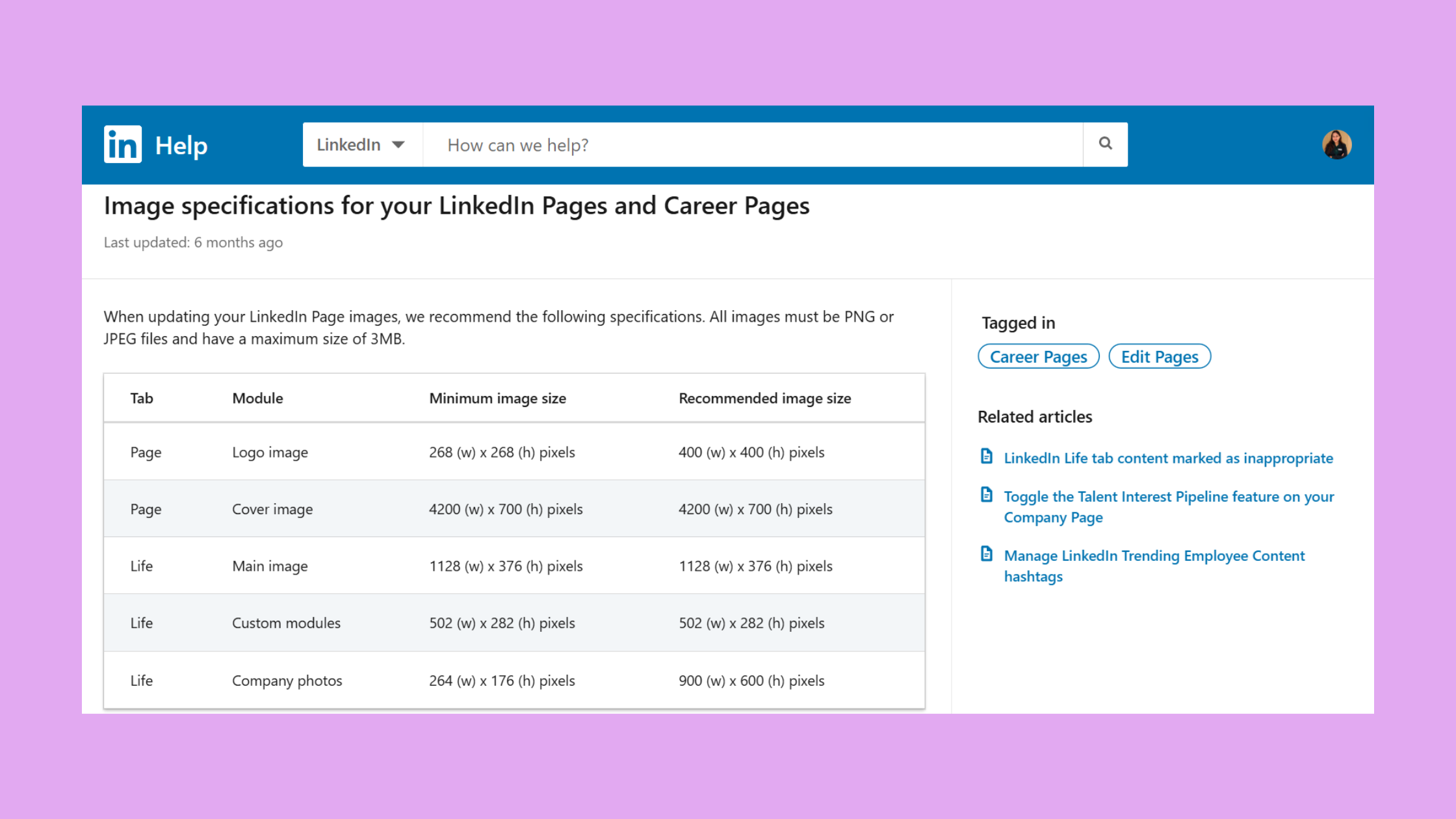
Rather than a single spec, LinkedIn uses format-specific rendering rules. Here is every dimension that matters, in one place.
| Format | Recommended Size | Aspect Ratio | Key Note |
|---|---|---|---|
| Single Image Post | 1200 × 627 px | 1.91:1 | Most common; safe for all feeds |
| Square Post | 1080 × 1080 px | 1:1 | More feed space on mobile |
| Portrait Post | 1080 × 1350 px | 4:5 | Cropped to 4:5 in feed preview |
| Carousel Slide | 1080 × 1080 px | 1:1 | Upload as PDF, not images |
| Article Cover | 1200 × 644 px | ~1.91:1 | Keep text away from bottom edge |
| Event Cover | 1600 × 900 px | 16:9 | Least-documented; often blurry |
| Profile Photo | 400 × 400 px (min) | 1:1 | Displays as circle; avoid edge content |
| Personal Banner | 1584 × 396 px | 4:1 | Safe zone: centre 60% |
| Company Logo | 300 × 300 px | 1:1 | PNG with transparent background |
| Sponsored Ad Image | 1200 × 627 px | 1.91:1 | Max 5 MB; JPG or PNG |
According to LinkedIn's Image Size Guide 2026, the minimum width for standard posts is 552 px — but anything below 1080 px wide will render noticeably soft on retina displays. In practice, 1080 px should be your floor, not your target.
LinkedIn Profile Banner Size and LinkedIn Profile Photo Size
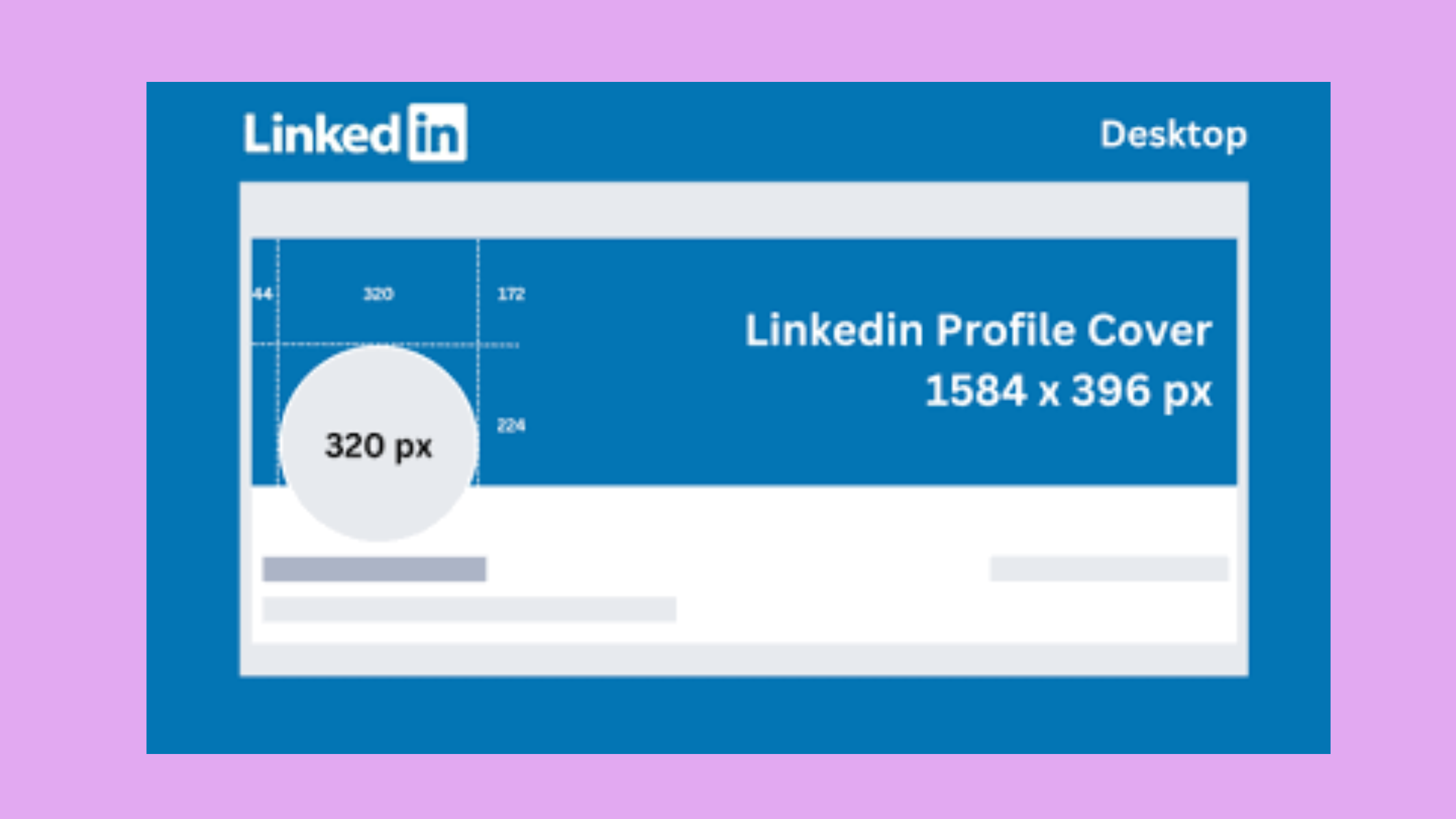
The linkedin profile banner size recommended by LinkedIn is 1584 × 396 px — a 4:1 ratio. The critical detail most guides skip: the left edge of your banner sits behind your profile photo on desktop, and the right edge gets clipped on mobile. Design your key content within the central 60% of the canvas to stay safely visible across both. For profile photos, 400 × 400 px is the minimum, but uploading at 800 × 800 px gives LinkedIn a higher-quality source to downsample from when displaying the circular crop. See our LinkedIn profile photo tips for what makes a photo perform beyond just dimensions.
For a complete breakdown of every banner variation — personal, company, and event — our ultimate LinkedIn cover photo size guide covers each with annotated safe zones.
LinkedIn Ad Image Size and Carousel Document Post Dimensions
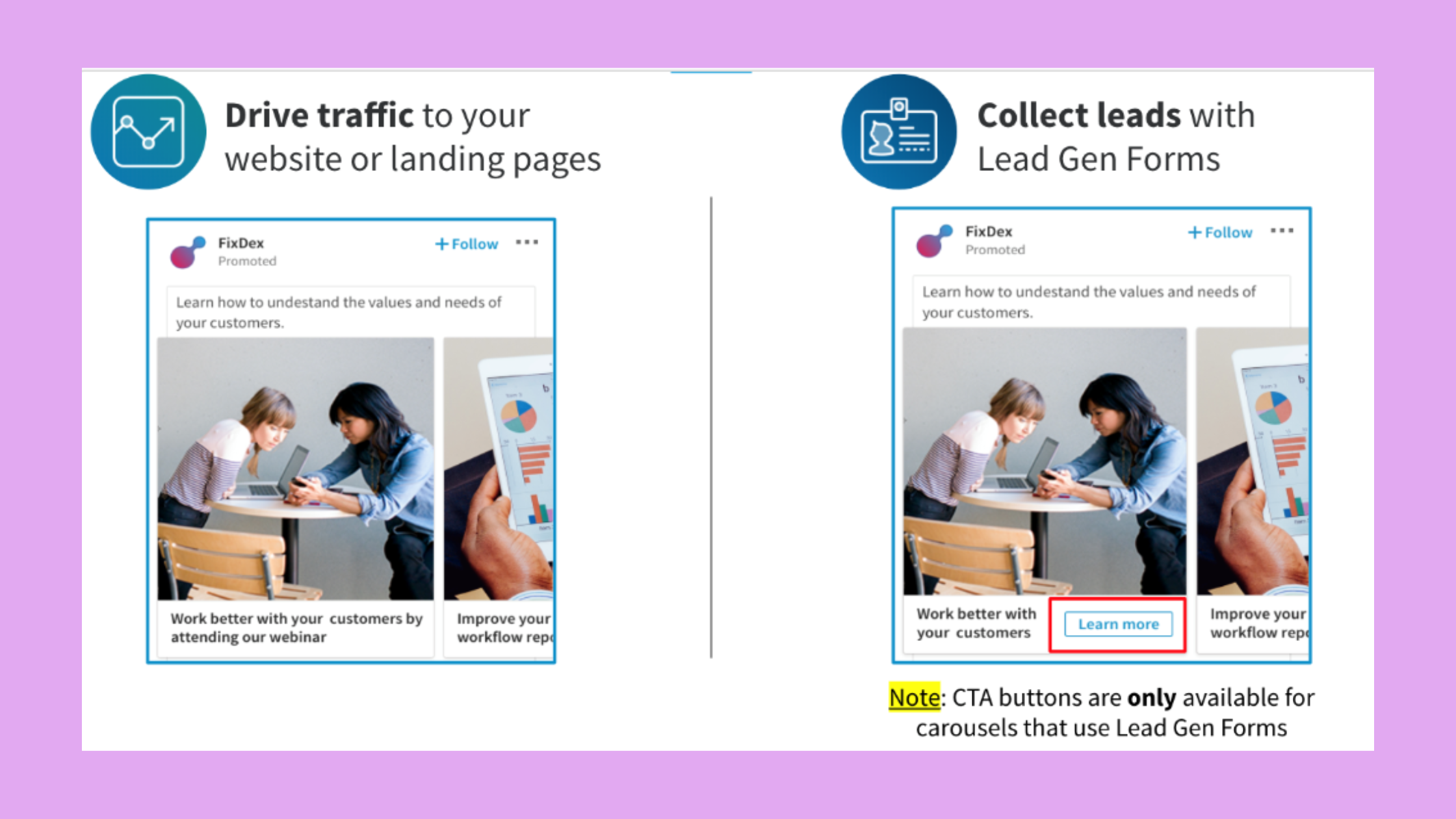
For LinkedIn carousel image size, each slide should be designed at 1080 × 1080 px square or 1920 × 1080 px landscape. The key detail that trips up most creators: individual image uploads do NOT create a swipeable carousel. You must combine all slides into a single PDF and upload it as a document post. LinkedIn then renders each PDF page as a swipeable slide. Keep text at least 80 px from any edge to avoid the UI overlay on mobile — the page-count indicator sits in the bottom-left corner and will cover content placed too close to that corner. For LinkedIn image dimensions 2024 and 2026 ad specs, sponsored single-image ads follow the same 1200 × 627 px standard, with a 5 MB maximum file size.
Does LinkedIn Compress Images — And How to Fight Back
LinkedIn compresses every uploaded image without exception — it re-encodes JPGs and PNGs to an internal quality target, which introduces visible artifacts on text-heavy graphics, fine lines, and gradients. This is one of the most misunderstood behaviours on the platform, and it directly affects how professional your content looks in the feed.
Uploading a 4000 × 4000 px image does not produce a crisper result. LinkedIn compresses to its internal target regardless — and oversized uploads introduce an additional resampling step that often makes things worse, not better.
The most effective way to minimise quality loss: upload at exactly the recommended pixel dimensions, not larger. For graphics with text or flat colours, use PNG — it preserves sharp edges better under re-encoding. For photography, export as JPG at 85–90% quality, which gives LinkedIn less to compress. According to La Growth Machine's 2026 specs guide, profile photos render best at 400 × 400 px minimum, with their data showing noticeably sharper output when uploaded close to that exact target rather than at 2× or 3× oversize.
Why Is My LinkedIn Image Getting Cropped — and How to Fix It
The LinkedIn image aspect ratio is the most common culprit behind cropping. LinkedIn auto-crops anything taller than 4:5 in the feed preview — so a 1080 × 1350 px portrait image displays correctly, but a 1080 × 1800 px image gets cut at the 4:5 mark. The bottom portion is hidden until the user clicks through. Fix it by checking your canvas dimensions before export, or use our image size guide for LinkedIn posts as a quick export reference. The linkedin profile picture size ratio is always 1:1 — LinkedIn crops any non-square profile photo to a circle, so anything important near the corners of a rectangular photo will be clipped.
How to Make Images Look Good on LinkedIn — Best Practices and Common Mistakes
Correct dimensions are the floor, not the ceiling. Teams that pair right-sized images with strong visual design consistently outperform those who only fix their specs. Here is what separates posts that get scrolled past from posts that stop the thumb.
- Use high-contrast text overlays — aim for at least a 4.5:1 contrast ratio. LinkedIn's off-white feed background washes out light-coloured text that reads fine on a dark design canvas.
- Design for mobile first — LinkedIn serves lower-resolution versions to mobile feeds. Check legibility at 375 px viewport width, not just your desktop monitor.
- Avoid portrait orientation for key content — LinkedIn crops portrait images in the feed preview, hiding the bottom. Landscape (1.91:1) or square (1:1) is more predictable.
- Keep logos and CTAs in the safe zone — centre 70% of the canvas is safe across all devices. Anything in the outer edges risks being clipped by UI elements.
- Save a LinkedIn export preset in your design tool so you're never re-entering dimensions manually.
Best Tools to Resize Images for LinkedIn in 2026
Among the best tools to resize images for LinkedIn, Canva and Adobe Express both offer pre-built LinkedIn templates at the correct dimensions — they're the fastest starting point for non-designers. For developers and automation workflows, Cloudinary and imgix handle dimension-correct exports programmatically. For quick one-off resizes, Squoosh (by Google) lets you control compression settings manually, which is valuable when you want to minimise quality loss before LinkedIn applies its own re-encoding pass. What image format does LinkedIn support? JPG, PNG, and GIF are all accepted for standard posts; PDF is required for carousel/document posts; LinkedIn does not currently support WebP uploads natively.
LinkedIn Shared Image Not Showing Correctly — Troubleshooting & Algorithm Impact
A recurring pattern among marketers sharing external links on LinkedIn is the blank or broken preview image — and the fix is almost always the same. LinkedIn pulls the preview from the Open Graph og:image meta tag on the destination URL. For it to render, the image must be:
- At least 1200 × 627 px
- Publicly accessible (no login walls, bot-blocking, or private CDN restrictions)
- Reachable by LinkedIn's crawler at the time of posting
If your link preview is showing the wrong image, force LinkedIn to re-scrape the URL using the LinkedIn Post Inspector — it refreshes the cached Open Graph data within minutes.
On the question of whether the LinkedIn image size differ for personal profiles versus company pages: company page posts render images in a slightly narrower container on desktop due to the sidebar layout. The 1:1 square format is the safest universal choice across both. As detailed in our complete LinkedIn image sizes guide, the rendering differences are subtle but visible on high-resolution displays.
Getting dimensions right is the prerequisite — but a well-formatted image still needs an audience to land in front of. Tools like HyperClapper let you amplify LinkedIn posts through real community engagement and AI-powered replies, which compounds the reach of well-formatted visual content. A strong image earns the first impression; genuine engagement keeps the post circulating in the feed.
Get Your LinkedIn Posts Seen by More of the Right People
HyperClapper connects your posts with real engagement communities — so your perfectly-sized images actually get the reach they deserve.
Boost My LinkedIn Posts →✓ LinkedIn Image Publishing Checklist
- ☐Single image post: exported at 1200 × 627 px (landscape) or 1080 × 1080 px (square)
- ☐Carousel: all slides combined into a single PDF, each slide at 1080 × 1080 px
- ☐Format: PNG for text/graphics, JPG at 85–90% for photography
- ☐Key content kept within the central 70% of the canvas (safe zone)
- ☐Text contrast ratio at least 4.5:1 against LinkedIn's off-white feed background
- ☐Shared link preview: og:image set to 1200 × 627 px and publicly accessible
- ☐Legibility verified at 375 px viewport (mobile screen width)
Frequently Asked Questions About LinkedIn Image Sizes
What's a good image size for a LinkedIn post?
The best image size for a LinkedIn post is 1200 × 627 px for landscape or 1080 × 1080 px for square. Both render cleanly across mobile and desktop without auto-cropping. Square images occupy more vertical feed space on mobile, which tends to generate higher dwell time and more impressions.
What size are LinkedIn post images 2026?
For linkedin post size 2026, the standard recommended dimensions remain 1200 × 627 px (1.91:1 landscape) for single-image posts, with 1080 × 1080 px as the preferred square alternative. According to Screensnap's 2026 post size guide, these specs are consistent across personal profiles and company pages.
Is a LinkedIn post 16:9? What aspect ratio does LinkedIn support?
LinkedIn supports multiple aspect ratios. The most common is 1.91:1 (close to 16:9 but not exactly), followed by 1:1 square and 4:5 portrait. True 16:9 (1920 × 1080 px) works for video posts and carousel slides, but for standard image posts the 1.91:1 landscape format is the safer choice — LinkedIn crops true 16:9 images slightly in the feed preview.
How do I resize an image for a LinkedIn post?
The fastest approach: open Canva or Adobe Express, select the LinkedIn post template (pre-set to the correct dimensions), paste your content, and export as PNG or JPG. For batch resizing, Squoosh gives manual control over compression quality. Always export at the exact target dimensions rather than uploading oversized and letting LinkedIn scale down.
What are the exact pixel dimensions for a LinkedIn single image post in 2026?
The exact recommended linkedin post size in pixels is 1200 × 627 px for landscape orientation. Square posts are 1080 × 1080 px. The minimum accepted width is 552 px, but anything below 1080 px will appear noticeably soft on retina and high-DPI screens. These specs are unchanged from 2024 into 2026.
What is the ideal image size for a LinkedIn post?
What is the ideal image size for a LinkedIn post depends on your content type: 1200 × 627 px for link-style landscape posts, 1080 × 1080 px for standalone visual content that needs maximum feed presence on mobile. If you post across both personal and company pages, 1:1 square is the most universal format — it renders consistently in both feed containers.
What happens if I upload the wrong image size to LinkedIn?
LinkedIn will auto-crop, scale, or apply a blank placeholder depending on how far off the dimensions are. This reduces visual quality and, more importantly, signals to the algorithm that the post has low engagement — leading to reduced distribution. Consistently wrong image sizes can establish a pattern that suppresses reach over time.
Does LinkedIn compress images?
Yes — LinkedIn compresses images on every upload. It re-encodes JPG and PNG files to an internal quality target. Uploading at the exact recommended dimensions minimises the compression penalty. PNG handles re-encoding better for graphics with text; JPG at 85–90% quality is more efficient for photographs. Uploading at larger dimensions does not prevent compression.