A pattern observed consistently across LinkedIn accounts — from solo founders to marketing teams — is that the people frustrated by low engagement are almost never posting bad content. They're reading the wrong numbers. LinkedIn statistics to improve engagement aren't about tracking everything; they're about tracking the five or six signals that tell you what the algorithm is actually rewarding right now. According to Brenton Way (2026), carousel posts get 278% more engagement than video, and posts with images receive 98% more comments — yet most creators still post link previews and wonder why reach is declining. The data is already there. The challenge is knowing which numbers to act on.
- Impressions and follower count are vanity metrics — engagement velocity, comment depth, and CTR are what actually move reach.
- LinkedIn post reach vs impressions is a critical distinction: reach = unique viewers, impressions = total views including repeats.
- The LinkedIn engagement rate benchmark for organic posts sits between 1–5%; anything above 3% signals strong content resonance.
- Posting 3–5x per week with native formats (carousels, text-only with strong hooks) consistently outperforms link-heavy posts.
- Most engagement drops trace back to one of three causes: inconsistent schedule, too many outbound links, or an audience that grew faster than the content strategy evolved.
- Tools like HyperClapper let you act on your analytics immediately — boosting posts through real engagement channels rather than just observing the numbers.
- What LinkedIn Statistics Actually Tell You About Engagement
- How to Read Your LinkedIn Analytics Dashboard
- Building a LinkedIn Content Strategy Based on Data
- Why Your LinkedIn Engagement Is Dropping — and How to Fix It
- Tools That Turn LinkedIn Analytics Into Action
- Frequently Asked Questions About LinkedIn Statistics and Engagement
What LinkedIn Statistics Actually Tell You About Engagement in 2026

Most LinkedIn creators track the number that's easiest to see — impressions — and ignore the numbers that actually predict growth. What LinkedIn metrics actually matter for engagement comes down to five signals: reactions by type, comment count, share count, saves, and click-through rate. Follower count tells you nothing about content resonance. A 50,000-follower account posting link previews regularly sees lower organic reach than a 3,000-follower account posting native carousels with strong opening hooks.
LinkedIn post reach vs impressions is a distinction worth getting exact. Reach counts the number of unique people who saw a post. Impressions counts total views, including every repeat view from the same person. A post with 10,000 impressions and 3,000 reach means roughly 3 out of every 10 "views" were someone scrolling past the same post again — not new eyeballs. Confusing the two inflates your perceived audience size and leads to misjudging what's actually working.
Engagement velocity is the speed at which a post receives reactions and comments after publishing. LinkedIn's distribution model front-loads its decision: in the first 60–90 minutes after posting, the algorithm scores your content based on early reaction speed, comment quality, and dwell time. Posts that hit a threshold in that window get pushed to a wider audience. Posts that don't are quietly suppressed regardless of how good the content is.
The algorithm doesn't wait for your post to prove itself over a week. It makes a distribution decision within the first 90 minutes — which means everything about your posting strategy should be designed around winning that window.
LinkedIn Engagement Rate Benchmark: What's Good in 2026?
The LinkedIn engagement rate benchmark for organic personal posts sits between 1–5%, with a typical well-performing post landing around 2–3%. According to Sprout Social (2026), video content averages a 6% engagement rate, while Brenton Way (2026) reports multi-image posts achieving 6.60% on average. In practice, anything above 3% on a personal post signals strong content resonance with your current audience. Company pages run lower — typically 0.5–1% — because organic reach for brand accounts has contracted significantly over the past two years.
How to Read Your LinkedIn Analytics Dashboard and Find What Matters
The native LinkedIn analytics dashboard gives you post-level metrics, follower demographics, and content performance over time — but the layout buries the most useful data. Here's how to navigate it efficiently:
- Go to your profile → "Analytics" — this opens your personal dashboard (30 seconds)
- Select "Posts" from the left menu — you'll see per-post impressions, reactions, comments, shares, and clicks (1 minute)
- Sort by "Engagement rate" — not by impressions. This surfaces your actual best performers, not just your most-seen posts (30 seconds)
- Filter to the last 90 days — this gives you enough data to see patterns without including content from a different strategic period (30 seconds)
- Export the data as CSV — paste it into a spreadsheet, add a column for post format and topic, and patterns become immediately visible (2 minutes)
Native LinkedIn Insights vs Third-Party Analytics Tools
The LinkedIn analytics tool vs native insights question comes down to what you need to do next. Native LinkedIn insights are genuinely strong for post-level performance and audience demographics. What they lack is trend visualization over time, cross-post benchmarking, and scheduling optimization based on your specific audience activity windows. Third-party tools fill those gaps — but no external tool has access to LinkedIn's full algorithmic data. All tools work from the same API signals. The value-add is in how they surface, visualize, and act on those signals.
Building a LinkedIn Content Strategy Based on Your Data

A LinkedIn content strategy based on data starts with a simple exercise: pull your top 5 posts by engagement rate from the last 90 days and identify what they share. Format? Topic angle? Opening line structure? Length? In roughly 4 out of 5 cases, a clear pattern emerges within the first 10 posts reviewed — and that pattern is your content template.
The best time to post on LinkedIn for engagement is broadly Tuesday–Thursday, 8–10 AM and 12–1 PM in your audience's primary time zone. But your own analytics audience activity windows override any generic advice. If your follower base skews toward a different time zone or industry rhythm, the generic window is irrelevant. Check the "Follower analytics" section of your dashboard — it shows when your specific audience is most active.
How often should I post on LinkedIn is one of the most debated questions in the space. The data-backed answer is 3–5 times per week. Below 3x/week, algorithmic reach decays noticeably — accounts that drop to 1–2 posts per week typically take 3–4 weeks of consistent posting to recover their previous distribution levels. Above 5x/week, content quality tends to decline and audience fatigue sets in. Three quality posts per week outperform seven rushed ones every time.
On content types: does the LinkedIn algorithm favor certain content types? Yes, clearly. Native documents (carousels), text-only posts with strong hooks, and video under 90 seconds consistently outperform link-heavy posts — because they keep users on-platform longer. Outbound links signal low dwell-time intent to the algorithm and are actively deprioritized in feed distribution.
Using Post Performance Benchmarks to Improve LinkedIn Organic Reach
To improve LinkedIn organic reach, benchmark each post against your own historical average — not against global averages. A post with a 2.1% engagement rate looks weak against a 6% benchmark but strong against your personal average of 1.4%. Context matters. What you're looking for is relative improvement over time: if your 90-day average engagement rate is trending upward, the strategy is working. If it's flat or declining despite consistent posting, the content formula needs to change — not the frequency.
Why Your LinkedIn Engagement Is Dropping — and How to Fix It

Teams that diagnose a dropping engagement rate usually find the same three culprits when they actually look at the data. Inconsistent posting schedules break audience activity window momentum — LinkedIn's algorithm deprioritizes accounts that go quiet for 7+ days. Too many outbound links signal low dwell-time intent. And repurposed content from other platforms without native reformatting performs poorly because the format signals don't match what LinkedIn rewards.
Why is my LinkedIn engagement dropping is also, in many cases, an audience-content mismatch problem. A recurring pattern among professionals with 5K–20K followers is that engagement flatlines not because content quality dropped — but because the audience grew faster than the content strategy evolved. Early followers engaged with one kind of content; newer followers came for a different reason. Your analytics will show exactly when this divergence started: look for the post where your engagement rate peaked and started declining, then check what changed in your content format or topic focus around that date.
Common Mistakes That Tank LinkedIn Engagement (and What the Stats Reveal)
- Posting outbound links in the main post body — move links to the first comment instead; reach typically improves by 20–35% based on patterns seen across active creator accounts
- Ignoring the first 90-minute engagement window — if no one engages early, the algorithm suppresses distribution regardless of content quality
- Using the same format repeatedly — the algorithm appears to reward format variety; alternating between carousels, text-only, and polls sustains reach better than single-format consistency
- Checking analytics monthly instead of weekly — algorithm preferences shift faster than most creators realize; monthly reviews mean you're always 3–4 weeks behind
Tools That Turn LinkedIn Analytics Into Action
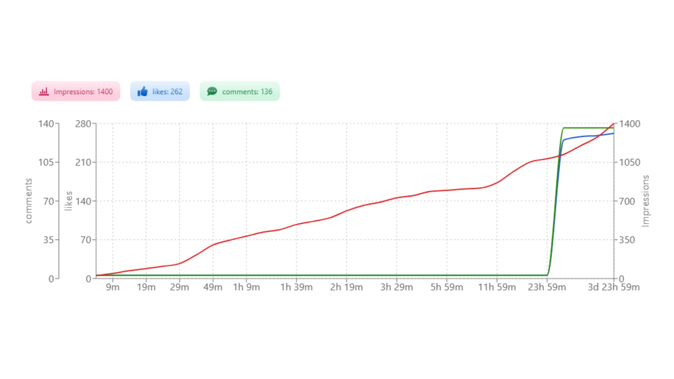
The gap between seeing what your analytics say and actually changing your engagement outcomes is where most professionals get stuck. Knowing that your engagement rate is 1.2% doesn't help unless you can immediately do something about it. The most useful best LinkedIn analytics tools are the ones that close the loop between insight and action.
Native LinkedIn analytics are the right starting point for most individuals — they're free, accurate, and cover the core metrics. Third-party tools like Shield, Taplio, and HyperClapper add layers that native insights don't: trend visualization over time, cross-post content benchmarking, and scheduling optimization based on your audience's specific activity windows rather than global averages.
What separates top-performing accounts from average ones isn't access to better data — it's the speed of acting on that data. HyperClapper's differentiator is that it combines analytics with immediate execution: after identifying a post that needs early engagement momentum, users can boost it through real community engagement channels (groups of real people who engage with posts), add AI-powered replies to sustain comment depth, and track the performance lift — all within the same platform. That's meaningfully different from a tool that only visualizes what already happened. You can see a full comparison of how this approach stacks up in the top LinkedIn engagement tools roundup or in the real vs paid LinkedIn engagement breakdown.
✓ The LinkedIn Analytics Action Checklist
- ☐Export last 90 days of post data and sort by engagement rate (not impressions)
- ☐Tag each top-5 post by format, topic, and opening line style — look for shared patterns
- ☐Check "Follower analytics" for your audience's actual peak activity times — use these instead of generic advice
- ☐Confirm posting frequency is 3–5x per week; identify any gaps longer than 7 days in the last month
- ☐Move all outbound links from post body to first comment on your next 5 posts — compare reach
- ☐Plan first-90-minute engagement: who will comment early? Consider a tool like HyperClapper to trigger real early engagement on priority posts
Turn your analytics insights into actual engagement — starting with your next post
HyperClapper connects analytics with real community engagement channels, AI replies, and post boosting in one place.
Try HyperClapper FreeFrequently Asked Questions About LinkedIn Statistics and Engagement
What is the 5 5 5 rule for LinkedIn success?
The 5-5-5 rule suggests engaging with 5 posts, commenting on 5 others, and connecting with 5 new people daily. It's a manual engagement habit designed to signal activity to LinkedIn's algorithm and grow your network through consistent reciprocal interaction — not a platform-official rule, but a widely used practitioner framework.
What is the 3 2 1 rule on LinkedIn?
The 3-2-1 rule is a content mix framework: 3 educational posts, 2 engaging or opinion-based posts, and 1 promotional post per publishing cycle. It prevents over-promotion and keeps content resonance high by leading with value. Accounts following this mix typically see stronger comment engagement than those posting primarily self-promotional content.
What is the 95-5 rule on LinkedIn?
The 95-5 rule reflects B2B buying behaviour: 95% of your LinkedIn audience isn't ready to buy right now, and only 5% is. This means the majority of your content should build brand familiarity and trust — not convert — so that when the 95% enter a buying window, they already know you. It's a long-game content positioning principle.
How can I tell which LinkedIn posts are actually driving engagement from my analytics?
Sort your posts by engagement rate — not impressions — in the native analytics dashboard. Posts with high engagement rates but modest impressions are resonating deeply with a smaller audience; posts with high impressions but low engagement are getting distributed but not connecting. The engagement rate column reveals content quality; the impressions column reveals distribution reach.
Why do some LinkedIn posts get high impressions but low engagement?
High impressions with low engagement typically means the post appeared in feeds but didn't earn a reaction or stop the scroll. The most common causes are a weak opening line that doesn't create a reason to read further, a topic that's visible but not relevant to the audience, or a format (like an outbound link preview) that signals low dwell-time intent and gets distributed but not engaged with.
How do LinkedIn impressions and clicks translate into real business results?
Impressions build brand familiarity over time — consistent high-impression content makes you recognizable before a conversation starts. Clicks signal genuine interest and are the strongest predictor of profile visits, connection requests, and inbound messages. Tracking the click-to-impression ratio across your top posts reveals which content actually moves people from passive viewing to active interest.
What should I do differently on LinkedIn after seeing low engagement stats?
Start with format before topic: switch from link posts to native carousels or text-only posts for the next 4 weeks and compare engagement rate. Then review your opening lines — the first two sentences determine whether someone reads further. Low engagement stats almost always point to a format or hook problem before a content quality problem.
What consistently separates accounts with real, growing reach from accounts with impressive follower numbers is not any single tactic — it's the combination of reading the right metrics, acting on them weekly, and structuring every post to win the first 90 minutes. Accounts that build that discipline see compounding improvements in organic distribution. Accounts that skip even one element typically plateau regardless of how good the content itself is.