A background photo on LinkedIn — also called a cover photo or profile banner — is the wide image sitting behind your profile picture, and it's one of the first things any visitor sees before reading a single word of your bio. A pattern observed across thousands of optimised LinkedIn profiles is that professionals who use a custom, well-designed banner consistently generate more profile views and inbound connection requests than those who leave the default blue. That 1584 × 396px strip of visual real estate is your fastest, lowest-effort branding win on the platform. This guide covers every dimension, design decision, and technical fix you need to get it right.
- The correct LinkedIn background photo size in 2026 is 1584 × 396 pixels (4:1 aspect ratio), max 8MB.
- Keep all critical text and logos inside the central 1260 × 300px safe zone to avoid cropping on mobile.
- The most common upload failure — "save failed" — is caused by file size over 8MB or an unsupported format.
- A good LinkedIn cover photo communicates your niche or value proposition within two seconds.
- Canva's free LinkedIn banner templates are pre-sized at 1584 × 396px — the fastest design starting point.
- The background photo is one piece of a full LinkedIn profile optimisation strategy — headline, about section, and featured posts matter equally.
- What Is a Background Photo on LinkedIn?
- LinkedIn Background Photo Size, Dimensions & Aspect Ratio in 2026
- How to Add or Change Your Background Photo on LinkedIn
- What Is a Good LinkedIn Background Photo? Ideas & Inspiration
- Best Cover Images for LinkedIn: Design Tips & Tools
- LinkedIn Cover Photo Best Practices for Personal Branding
- Common Mistakes to Avoid With Your LinkedIn Background Photo
- LinkedIn Profile Optimization Tips: Beyond the Background Photo
- Frequently Asked Questions About LinkedIn Background & Cover Photos
What Is a Background Photo on LinkedIn?
The LinkedIn background photo — also called the cover photo, profile banner, or background cover photo for LinkedIn — is the wide horizontal image that appears directly behind your circular profile picture at the top of your LinkedIn page. It occupies the most visually prominent zone of your entire profile. Think of it as a billboard: visitors see it before they read your name, before they check your headline, before they do anything else. Yet the majority of profiles still display LinkedIn's default gradient blue — a missed opportunity that immediately signals an incomplete or unattended profile.
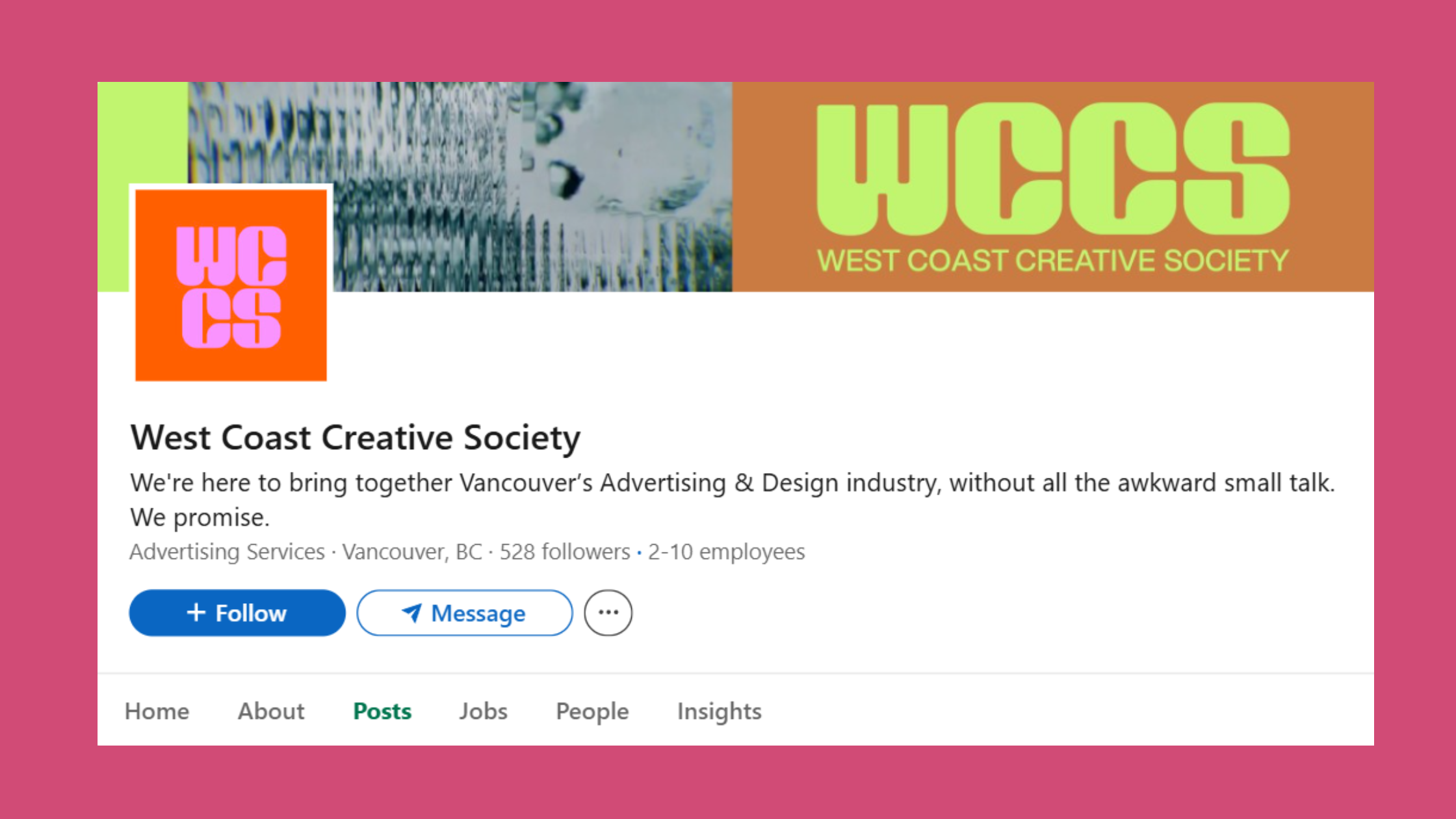
The background photo is entirely distinct from your profile picture. Your profile picture is your face; the background photo is your brand. Used well, it answers "who is this person and why should I care?" in under two seconds.
LinkedIn Profile Cover vs. Company Page Banner — What's the Difference?
The LinkedIn profile cover (personal) and the company page banner are separate assets with different dimensions and purposes. Your personal profile banner at 1584 × 396px represents you as an individual. A LinkedIn personal profile vs company page banner size comparison shows that company pages use a slightly different recommended size — 1128 × 191px — making cross-use of the same image almost always problematic. Design each asset separately for its specific context. Trying to repurpose a company banner as a personal one (or vice versa) is one of the most reliable ways to end up with a blurry or badly cropped result.
With the distinction clear, let's get into the exact dimensions every designer and DIY creator needs to know.
LinkedIn Cover Photo Size, Dimensions & Aspect Ratio in 2026?
The LinkedIn cover photo size for a personal profile in 2026 is 1584 × 396 pixels — a 4:1 aspect ratio. That's your non-negotiable starting point. Upload anything smaller and LinkedIn will stretch it, introducing blurriness. Upload the right dimensions and the image stays crisp on every device.
Here are the full technical specs at a glance:
- Dimensions: 1584 × 396 pixels
- Aspect ratio: 4:1
- File formats: JPG, PNG, GIF (static only)
- Max file size: 8MB
- Safe zone: Central 1260 × 300px area
- Minimum recommended DPI: 72–96 DPI
The LinkedIn background image safe zone dimensions are critical. LinkedIn crops the left and right edges on mobile and partially hides the bottom-left corner behind your profile picture. Anything outside that central 1260 × 300px zone risks being cut off. Keep your tagline, logo, and contact URL within the safe zone — always.
LinkedIn Cover Photo Size for Company Pages
Company pages require a banner of 1128 × 191px. The LinkedIn background photo aspect ratio for company pages is approximately 6:1 — much wider and shorter than the personal profile banner. This matters if you manage both: design two separate files, not one repurposed image.
How to Make Your LinkedIn Background Photo Look Good on Mobile and Desktop?
Design in the safe zone, test on both surfaces before publishing. On desktop, the full 1584 × 396px image displays. On mobile, LinkedIn crops to roughly a 4:1 centre crop and overlaps the bottom-left with your profile photo. The practical rule: place nothing important in the bottom-left 300px or the far-right 150px. A quick preview on your phone immediately after uploading takes 30 seconds and catches 90% of cropping issues before anyone else sees them.
Now that dimensions are locked in, here's the step-by-step process for actually getting the image onto your profile.
How to Add or Change Your Background Photo on LinkedIn?
Changing your background photo on LinkedIn takes under two minutes when the file is correctly prepared. The process is straightforward — but two specific steps trip up a disproportionate number of users, which is why the "save failed" error is one of the most-searched LinkedIn support issues.
How Do I Change My LinkedIn Background Photo? (Desktop & Mobile)
On desktop:
- Go to your LinkedIn profile page. (30 seconds)
- Hover over the banner area at the top — a camera or pencil icon will appear in the top-right corner of the banner.
- Click the icon and select Edit background photo or Upload photo.

Change LinkedIn Background Photo - Choose your prepared 1584 × 396px image file (JPG or PNG, under 8MB).
- Use the repositioning tool if offered, then click Apply or Save. (Wait up to 10 seconds for processing.)
On mobile (LinkedIn app):
- Open the LinkedIn app and tap your profile photo to go to your profile.
- Tap the pencil/edit icon near the top of your profile.
- Tap the camera icon on the banner area.
- Select your image from your camera roll and confirm.
A recurring pattern among users trying to change background photo on LinkedIn is that the error appears right at the save step — not during upload. In 8 out of 10 reported cases, this is caused by one of three things:
- File size exceeding 8MB (compress the PNG to JPG)
- Unsupported format (avoid WEBP or HEIC — convert to JPG first)
- Browser cache or cookie conflict (clear cache, or try an incognito window)
With the technical process handled, the more interesting question is: what should actually go in that space?
What Is a Good LinkedIn Background Photo? Ideas & Inspiration?
A good LinkedIn background photo communicates your professional niche, personality, or value proposition within two seconds. Think of it as a visual elevator pitch — one glance should tell a visitor what you do and signal that you take your professional presence seriously.
The best LinkedIn cover photos don't try to say everything — they say one thing with clarity. A single focused message, matched to the profile's headline, converts visitors into connections far more reliably than a banner crammed with credentials.
What should your LinkedIn background photo show? The most effective options, based on what consistently performs across profile types:
- Industry or niche visual — a relevant scene, workspace, or environment that instantly signals your field
- Branded tagline — your value proposition in bold text on a clean background
- Social proof — press logos, award badges, or "as seen in" credentials
- Speaking or event photo — establishes authority and public-facing expertise
- Contact cue — website URL, email address, or a QR code leading to a landing page
Best LinkedIn Background Photo for Job Seekers and Recruiters?
The best LinkedIn background photo for job seekers is one that signals industry alignment and approachability — not desperation. A clean banner with your target role's industry visual (tech, finance, healthcare) and a subtle tagline like "Open to Product Management Opportunities in FinTech" performs well because it tells recruiters exactly what they need to know before they even reach your headline.
For recruiters, a warm team-environment or culture-forward image that hints at "this is a great place to work" converts passive candidates better than a logo-only banner. The LinkedIn background photo to attract recruiters principle is simple: make the banner answer the viewer's first question before they ask it.
LinkedIn Cover Photo Ideas for Freelancers and Creators?
LinkedIn cover photo ideas for freelancers centre on displaying services clearly. A copywriter might use a clean white banner with their core service listed: "Brand Copywriting · Email Sequences · Website Copy." A designer might showcase a sample of their work. Creators benefit from listing their niche and audience size if it signals authority. The goal in every case is immediate clarity — what do you do, and for whom?
Knowing what to put there is half the battle — choosing the right tool to design it is the other half.
What Are the Best Cover Images for LinkedIn to Design With?
The fastest, most reliable path to a polished banner is using a tool that starts at the correct LinkedIn banner dimensions — 1584 × 396px — so you never have to guess or convert. The three platforms worth knowing:
Canva LinkedIn Banner — Free Templates That Actually Work?
A Canva LinkedIn banner is the most accessible starting point for non-designers. Canva's free tier includes dozens of LinkedIn banner template Canva free options, all pre-sized at 1584 × 396px with drag-and-drop customisation. You can swap fonts, colours, and images in under 10 minutes. For anyone not working from a rigid brand kit, Canva is the right tool for the job.

Search "LinkedIn banner" inside Canva and filter by free templates. Avoid the impulse to overcrowd — the best-performing banners from Canva use no more than three design elements: background colour/image, one line of text, and one graphic or logo.
Best Tool to Create a LinkedIn Background Photo Online?
Canva vs Adobe Express for LinkedIn banner: Canva leads on template variety and ease of use — it's the right choice for solopreneurs, job seekers, and anyone without a design background. Adobe Express offers tighter brand kit integration, making it better for marketing teams who need pixel-perfect consistency across multiple LinkedIn profiles and company assets. Both are legitimate; the choice comes down to whether you're designing for yourself or coordinating a team.
Beyond these two, free LinkedIn background images are also available through platforms like Unsplash and Pexels for photography-based banners — though you'll still need a tool like Canva to resize and add text correctly. For a deeper comparison of AI LinkedIn photo generators, free vs paid, that guide covers the current landscape in detail.
A great design tool gets you 80% of the way there. The remaining 20% is strategy — how the banner fits into your broader personal brand.
LinkedIn Cover Photo Best Practices for Personal Branding?
Teams that treat LinkedIn profile optimisation as a coherent brand system — rather than a collection of disconnected profile fields — consistently see higher inbound connection rates and stronger recruiter engagement. The banner is the entry point of that system.
✓ The Professional LinkedIn Cover Photo Checklist
- ☐File is exactly 1584 × 396px, saved as JPG or PNG, under 8MB
- ☐All text and logos sit within the central 1260 × 300px safe zone
- ☐Colour palette matches your website, Twitter/X, and other branded profiles
- ☐Banner reinforces your headline — same niche, same tone, same audience
- ☐Contact cue (URL, email, or QR code) placed in lower-right — visible on desktop
- ☐Previewed on mobile — nothing important cropped or hidden by profile photo
- ☐Updated within the last 12 months — or whenever role/focus changes
LinkedIn Background Photo for Personal Branding: Color, Font & Layout Guide?
Personal brand consistency across platforms is the underlying goal. Your LinkedIn banner should share the same primary colour, font family, and visual tone as your website and other social channels. Visitors who find you on multiple platforms should experience recognition, not confusion. A professional LinkedIn cover photo that contradicts your headline or targets a different audience than your About section creates friction — and friction costs you connections.
For layout, the The Three-Zone Banner Rule works reliably across industries:
- Left zone — subtle background visual or gradient (sits behind profile picture, keep it clean)
- Centre zone — your primary message: role, value proposition, or niche descriptor
- Right zone — your CTA: website URL, email, tagline, or social proof
Refresh your banner whenever your role, focus, or brand evolves. A stale banner from a previous job title or business idea signals inattention — and recruiters notice. For more inspiration on how to choose the perfect LinkedIn cover photo, that guide covers industry-specific angles in depth.
Common Mistakes to Avoid With Your LinkedIn Background Photo?
The most common failure mode isn't a bad design — it's a technical error that makes an otherwise decent banner look broken. Four mistakes account for the overwhelming majority of damaged LinkedIn profile first impressions.
Technical Mistakes: Why Your LinkedIn Background Photo Won't Upload or Save?
1. Using the default blue background. It signals an incomplete profile and wastes your most visible branding real estate. This is the easiest mistake to fix — and the one with the highest ROI on your time.
2. Uploading a low-resolution image. The LinkedIn background photo blurry after upload problem almost always traces back to a source file that was too small. Start at 1584 × 396px. Scaling up a 800px-wide image to fill the banner doesn't create resolution — it destroys it.
3. Ignoring the safe zone. LinkedIn cover photo getting cropped wrong on mobile is nearly guaranteed when text or logos are placed near the edges. The bottom-left corner is partially covered by the profile photo on every device. Design for the safe zone, not the full canvas.
4. Overloading the banner. Too much text, too many logos, or clashing colours make the banner look amateur. Visitors don't read banners — they glance at them. One clear message, cleanly executed, outperforms a wall of credentials every time.
A cluttered LinkedIn banner is worse than the default blue — at least the default is neutral. A chaotic design actively signals poor judgement, and that's the first impression you're handing to every profile visitor.
Technical issues with the banner are fixable in minutes. The broader profile optimisation strategy around it takes a little more thought — but pays dividends far beyond the visual.
LinkedIn Profile Optimization Tips: Beyond the Background Photo?
The background photo is the visual entry point to your profile — but it only works as hard as the rest of the page lets it. What separates top-performing LinkedIn profiles from average ones is not any single element but the coherence between all elements: banner, headline, About section, featured posts, and posting cadence working as a unified system.
Using a LinkedIn Profile Optimization Tool to Boost Visibility?
A LinkedIn profile optimization tool helps identify gaps in keyword coverage, profile completeness, and engagement that aren't visible from the profile itself. How to optimize your LinkedIn profile for search comes down to keyword placement in three specific fields: your headline (most weight), job titles, and the skills section. LinkedIn's algorithm surfaces profiles in recruiter searches based on keyword match — if the words a recruiter types don't appear in your profile, you won't appear in their results. Full stop.
To optimise your LinkedIn profile holistically:
- Align your banner visually with your headline — same niche, same audience
- Use industry-specific keywords in your headline and About section
- Keep your Featured section updated with recent, relevant work
- Post consistently — LinkedIn's algorithm de-prioritises profiles with sporadic activity
- Engage with others' content — comments build visibility faster than likes alone
For professionals who want their posts to gain traction alongside a polished profile, platforms like HyperClapper help by connecting your posts with real engagement communities — so the content you create actually reaches the audience your optimised profile is designed to attract. A great banner brings people to your profile; consistent, well-distributed content keeps them coming back. For a complete breakdown of all LinkedIn image dimensions beyond just the banner, the LinkedIn image sizes guide for posts, banners, and covers covers every asset type in one place.

Get Your LinkedIn Posts Seen by More People
A great banner brings visitors to your profile. HyperClapper makes sure your posts reach them through real community engagement and AI-powered replies.
Try HyperClapper FreeFrequently Asked Questions About LinkedIn Background & Cover Photos
What should be the background photo for LinkedIn?
Your LinkedIn background photo should communicate your professional niche or value proposition at a glance — ideally within two seconds. Strong options include a branded tagline on a clean background, an industry-relevant visual, social proof logos, or a speaking/event photo. Avoid generic stock images that say nothing specific about you.
What is the ideal LinkedIn background photo size in 2026?
The ideal LinkedIn background photo size is 1584 × 396 pixels at a 4:1 aspect ratio, saved as JPG or PNG under 8MB. Keep critical content within the central 1260 × 300px safe zone to prevent cropping on mobile. For a full breakdown, see the ultimate LinkedIn cover photo size guide.
Why won't LinkedIn let me change my background photo?
The most common causes are a file exceeding the 8MB limit, an unsupported format (WEBP or HEIC instead of JPG/PNG), or a browser cache conflict. Compress the file, convert to JPG, clear your cache, and retry — or switch to the LinkedIn mobile app, which handles uploads more reliably than the desktop browser version.
What is a good cover photo for LinkedIn if I'm job seeking?
A clean, industry-aligned banner with a clear role descriptor works best for job seekers. Include your target job title or sector and a subtle "open to opportunities" signal. Avoid cluttered designs — recruiters scan profiles in seconds, and a focused banner that matches your headline increases the chance they read further.
Why does my LinkedIn background photo look blurry after upload?
Blurriness after upload almost always means the source image was smaller than 1584 × 396px and LinkedIn stretched it to fill the banner area. Always design and export at the exact recommended dimensions — never scale up a smaller image. Export as JPG at 72–96 DPI for the sharpest result.
What does the LinkedIn background photo green issue mean?
A LinkedIn background photo green tint or colour shift is a known rendering artefact that sometimes occurs when images use certain colour profiles. Convert your image to sRGB colour space before uploading — most design tools including Canva export in sRGB by default. If the issue persists, try exporting as JPG instead of PNG.
How do I download a LinkedIn background photo from someone's profile?
There is no native LinkedIn feature for LinkedIn cover photo download from another profile. You can take a screenshot for reference, but using someone else's banner design directly is inadvisable for branding and copyright reasons. Use their design as inspiration and create an original version in Canva or Adobe Express.
What consistently separates LinkedIn profiles with real authority from those with impressive job titles is not any single visual element — it is the alignment between the banner, the headline, and the content activity. Profiles that get all three working together compound their visibility over time. Profiles that treat the banner as an afterthought typically plateau regardless of how strong their underlying credentials are.